INTO - Design system
Overview
Designers at INTO were facing various challenges when building new pages and journeys. Speaking with designers across the organisation and watching them work I noticed the same issues surfacing time and time again.
- Designers struggling to find the most recent pattern due to no SSOT.
- Creating the same component/pattern or copying from other documents.
- Re-create component/patttern as unable to locate original.
- Various colours, text styles, and heading tags in Sketch files.
- Consistency across pages due to different designers working on the same project.
- Handing designs to developers with inconsistencies or without certain states/variants.
From my observations time and money was being wasted due to these reoccurring issues. It was clear INTO needed a design system to help manage and deliver a solid, consistent and on-brand digital experiences. Speaking with senior stakeholders in the company they agreed, however didn’t have the budget for a fully developed design system. They agreed however to start with a style guide and component/pattern library for INTO study. This would be a step towards a design system and in the short term provide the designers at INTO with a solution to their problems.
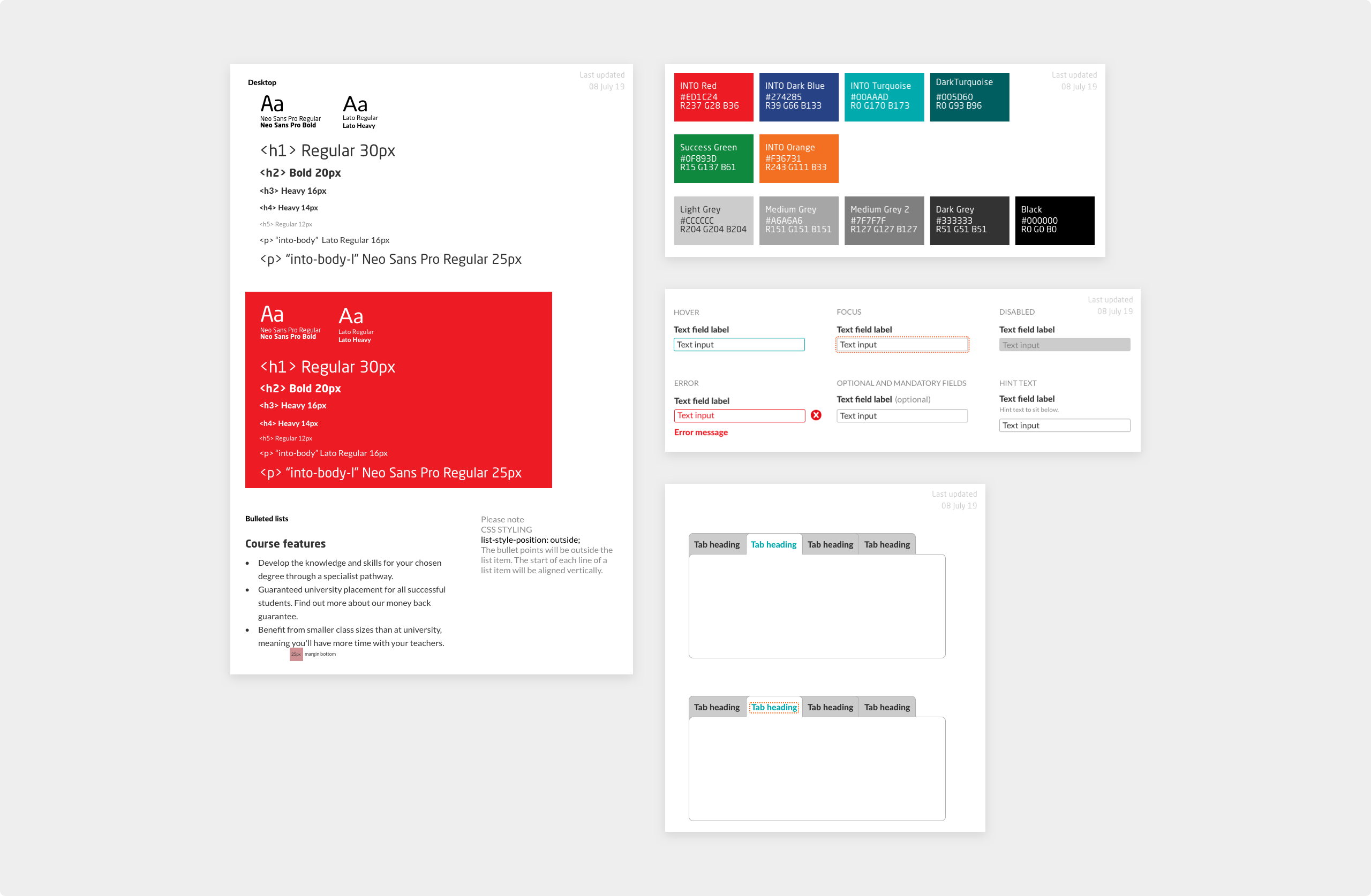
The existing INTO style guide. This was created in Sketch by a designer no longer at INTO. None of the components were symbols and designers also noticed some components weren’t up to date.
Audit
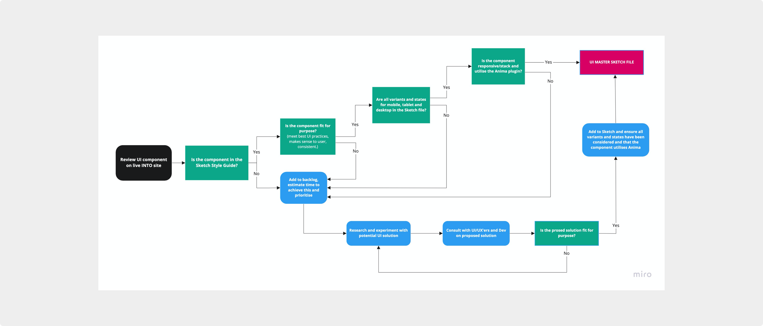
To really understand just how big an issue this was I decided to undertake a UI audit of the entire INTO study website. I used Miro which allowed me to document the inconsistencies and share with the wider team and stakeholders. I made notes on key issues that needed addressing such as accessibility failures.
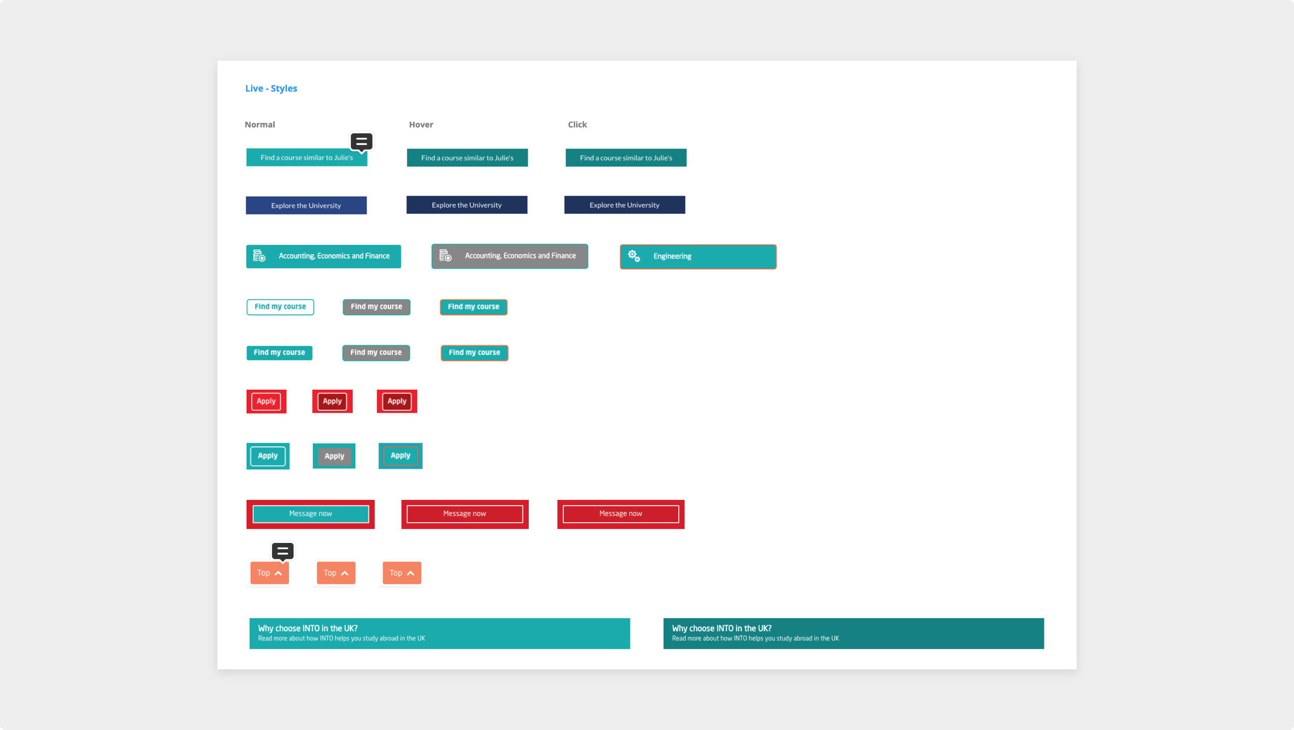
For each component I took a screenshot all the inconsistencies from the live site. This was a time consuming task but highlighted why it was important to have a components/pattern library. It was also useful from a UX perspective to see the various uses of components.
My process for designing, documenting and adding components to the pattern library.
Research
When adding or changing components I would first conducted research to ensure key factors like best practice, accessibility and usability were at the foundation. Existing systems such as GOV.UK, IBM Carbon and Google Material had data and findings I could use to help make informed design decisions.
As this would be used not only by myself but designers across INTO I wanted to make sure any research I conducted was available and accessible to everyone. I used Miro to document this and held weekly design sessions to present this back to designers and key stakeholders.
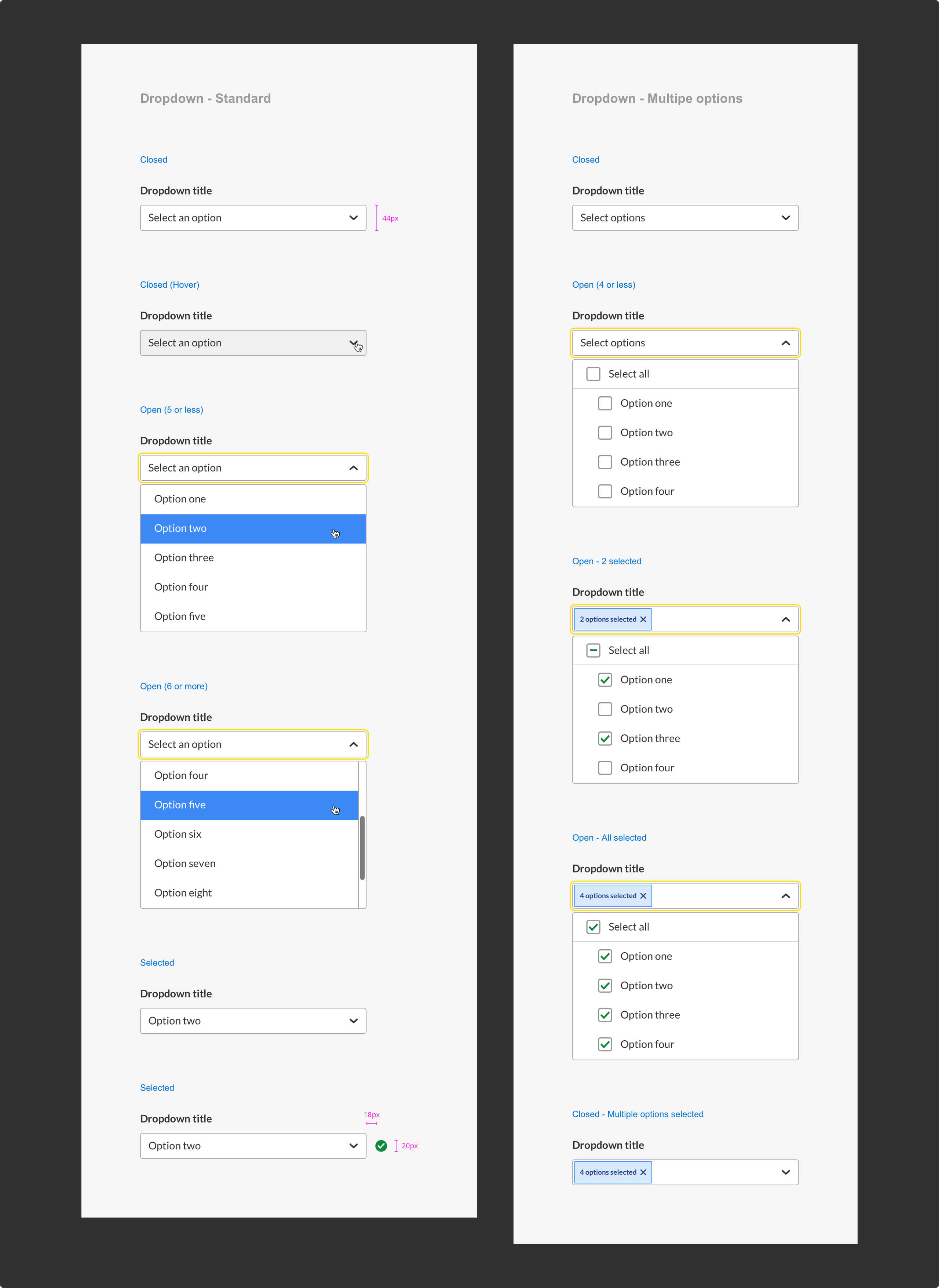
Example of the dropdown component with all the states, variants and overrides. This level of detail was necessary for each component to ensure all interactions for both desktop and mobile had been considered.
Construction
The Sketch component/pattern library was only half the solution as simply handing this to designers would only solve a few problems. I needed to ensure the library would be used correctly and consistently otherwise the same issues would start to appear. I needed a way of presenting the components and patterns alongside guidance.
Each component needed to have detailed guidance as to what it was, were it should be used, its relationship with other components and variants/states. I didn’t want this to be buried in the Sketch document as it could get missed and developers wouldn’t have visibility of it.
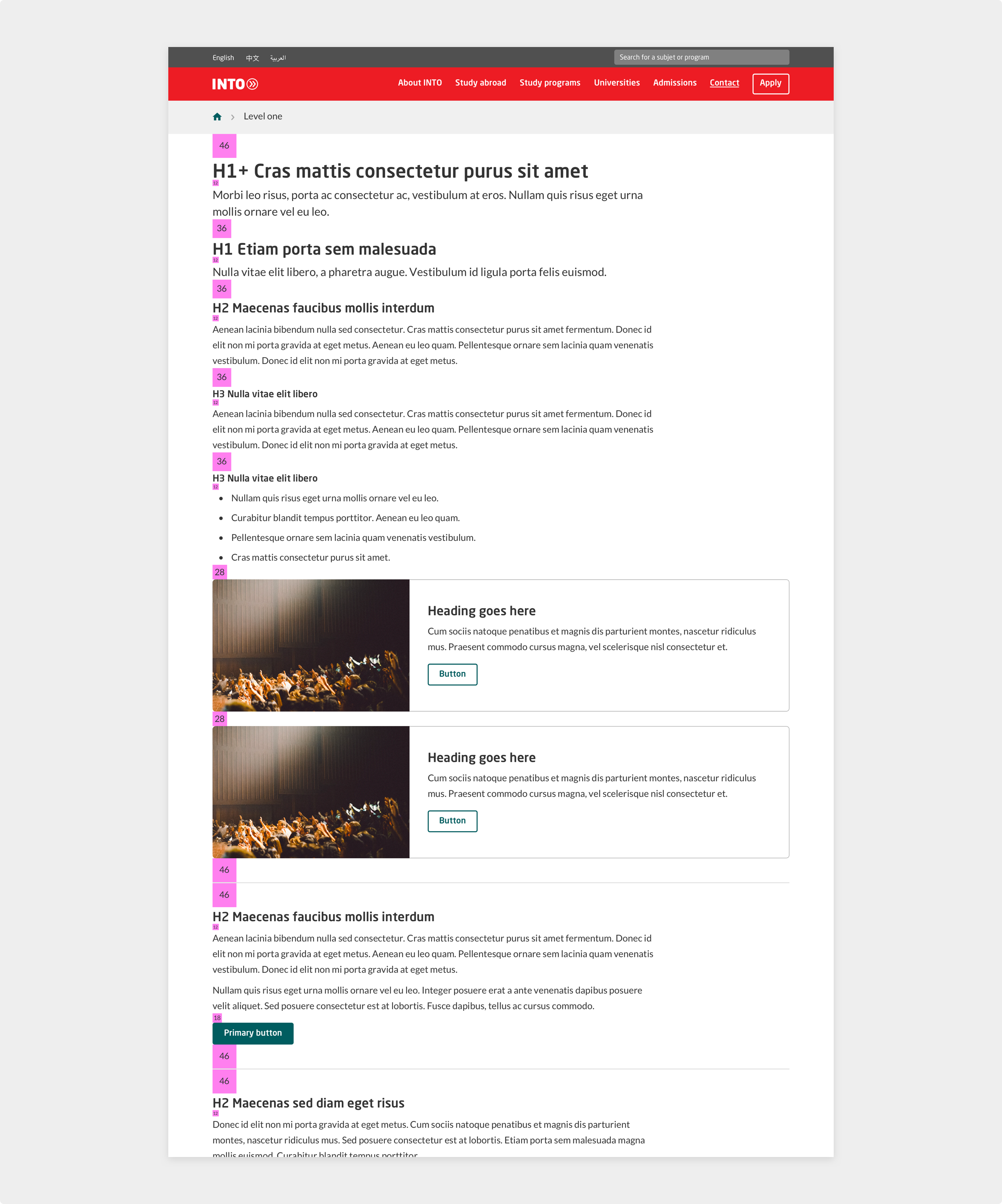
Page built using spacing blocks to ensure consistent spacing when constructing new pages.
Management
Having looked into various Design System management tools I found InVision’s DSM to be the perfect solution. It allowed me to export all the symbols straight from Sketch as well as write guidance around how they should be used. It could be accessed by anyone with a web browser and most importantly it didn’t require developers or project managers to have Sketch.
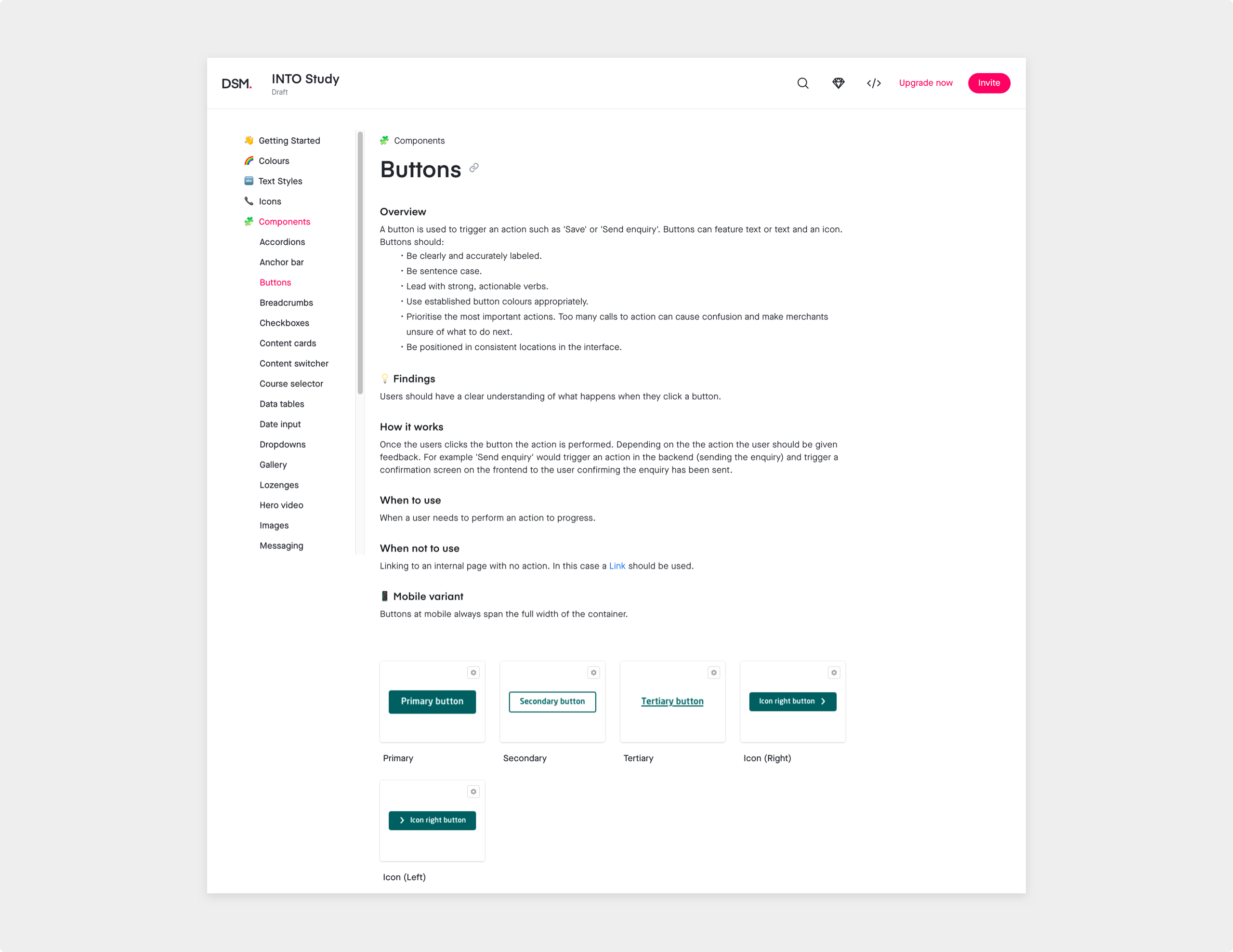
Button component in the Design System Manager. This gives all the information designers need as well as documents the variants, primary, secondary and tertiary.
Results
To measure the efficiency of the new Sketch library and DSM I set 2 of the INTO UI designers a task. I gave them an existing page on INTO Study and told them to build it using the new system. Both were familiar with Sketch and understood symbols and overrides. It took both designers 30-45 mins to build the entire page from scratch. Both designers said this time would fall further once they had become more familiar with the Sketch library. Comparing both pages together they were identical with regards to text styles, symbols, colours and spacing.
Following the review I asked both designers how long this would have taken before and they estimated around 1½ - 2 hours. Which roughly works out as an increase in productivity of 200%.